
Why CSS gap is the modern spacing solution
For years, developers have fought a silent battle against one of the most persistent layout problems in CSS: managing the space between elements.
If you've ever had to use negative margins, apply margins to every element except the last one using :not(:last-child), or wrestle with the cascading behavior of margins creating unwanted space outside the container, you know the frustration. These "margin hacks" are messy, break when layouts change, and are a nightmare to maintain.
The good news? Those days are over.
The CSS gap property is the clean, modern solution designed specifically to solve this problem. It allows you to specify spacing only between flex items or grid cells, acting like a pristine divider that never adds space to the container's edges.
Initially introduced for CSS Grid, the property has now been fully adopted by Flexbox as well - delivering the highly requested feature many developers call CSS flex gap. This guide provides the definitive, complete walkthrough for using the gap property across both major layout systems, permanently retiring your reliance on margin hacks.
CSS gap syntax and properties
Before applying gap to any layout, it's essential to understand its foundational syntax. The gap property is a powerful shorthand that combines two distinct properties: row-gap and column-gap.
gap, row-gap, and column-gap syntax
The gap property defines the spacing along both the vertical and horizontal axes of your layout.
row-gap: Sets the space between rows (the vertical spacing).column-gap: Sets the space between columns (the horizontal spacing).
Crucial Point: Unlike margins which are applied to the items themselves, the gap property is applied directly to the container (display: grid; or display: flex;) and only affects the space between its children.
Using gap in CSS grid
The gap property was first introduced for CSS Grid, and it simplifies complex grid layouts immensely. Instead of manually calculating widths and adding margins to every column, you simply declare the gaps you need.
CSS Example: Grid Layout
Consider a three-column grid where we need consistent vertical and horizontal spacing:
HTML
<div class="grid-container">
  <div class="grid-item"></div>
  <div class="grid-item"></div>
  <div class="grid-item"></div>
  <div class="grid-item"></div>
  <div class="grid-item"></div>
  <div class="grid-item"></div>
</div>
CSS
.grid-container {
  display: grid;
  width: 500px;
  grid-template-columns: repeat(3, 1fr);
  /* Apply 30px between rows and 15px between columns */
  gap: 30px 15px;
}

.grid-item {
  padding: 20px;
  background-color: blue;
}
Output

This single line of CSS (gap: 30px 15px;) replaces several complicated margin rules, ensuring that the spacing is always perfectly contained within the grid.
Using gap in CSS flexbox
For Flexbox users, the introduction of gap support has been revolutionary, finally giving us the clean layout tool we needed. This feature is often referred to by developers as the CSS flex gap or flex-gap.
Why gap is a Game-Changer for Flexbox (The Flex Gap Solution)
In the past, creating space between flex items required margin workarounds (like margin-right on all items except the last one). This made things difficult when changing layouts or adding wrapping. CSS gap eliminates this issue by applying spacing based on the Flex container's axes.
Implementing gap in a Flex Container
To enable gap for Flexbox, you simply apply it to the parent container alongside display: flex;.
Flex Example 1 - Flex Direction Row
HTML
<div class="flex-container">
  <div class="flex-item"></div>
  <div class="flex-item"></div>
  <div class="flex-item"></div>
</div>
CSS
.flex-container {
  display: flex;
  flex-direction: row;
  /* Apply consistent space between items */
  gap: 5px;
}

.flex-item {
  padding: 50px;
  background-color: green;
}
Output

As you can see, a gap of 5px has been applied between each of our green flex items, by simply applying gap: 5px; to the flex container. Because our flex-direction is set to row, the gap property automatically applies between our flex items horizontally.
Flex Example 2 - Flex Direction Column
We’ll mostly reuse Example 1 above for this one, changing only the flex-direction to illustrate how gap adapts automatically.
HTML
<div class="flex-container">
  <div class="flex-item"></div>
  <div class="flex-item"></div>
  <div class="flex-item"></div>
</div>
CSS
.flex-container {
  display: flex;
  flex-direction: column; /* The change from Example 1 */
  gap: 5px;
}

.flex-item {
  padding: 50px;
  background-color: green;
}
Output

As you can see, gap automatically adapts to place its spacing between the flex items vertically based on our flex-direction being sent to column.
Horizontal vs. Vertical Flex Gaps (row-gap & column-gap)
As we illustrated in the examples above, the gap shorthand handles both horizontal and vertical spacing depending on the flex-direction property. But what if you need to control both?
We can achieve this using the properties column-gap and row-gap:
- When using
flex-direction: roworflex-direction: column- If you use
flex-direction: row(the default),column-gapcontrols the space between the main items. - If you use
flex-direction: column,row-gapcontrols the space between the main items. - The
gapshorthand handles both scenarios automatically.
- If you use
Flex gap and Wrapping (flex-wrap: wrap)
One of the biggest advantages of gap is that it manages spacing even when flex-items wrap (flex-wrap: wrap). Before gap we’d be left using top and bottom margins that can be disruptive to layouts (ie. layouts that don’t need top/bottom margin before flex items wrap).
Example - Flex Wrap with Gap
In this example we’ll apply gaps to flex items that wrap down to additional rows, using the gap property.
HTML
<div class="flex-container">
  <div class="flex-item"></div>
  <div class="flex-item"></div>
  <div class="flex-item"></div>
  <div class="flex-item"></div>
  <div class="flex-item"></div>
  <div class="flex-item"></div>
  <div class="flex-item"></div>
  <div class="flex-item"></div>
  <div class="flex-item"></div>
  <div class="flex-item"></div>
  <div class="flex-item"></div>
</div>
CSS
.flex-container {
  display: flex;
  flex-direction: row;
  flex-wrap: wrap;
  /* Automatically spaces items horizontally (column-gap) and vertically (row-gap) */
  gap: 10px;
  max-width: 500px;
}

.flex-item {
  padding: 50px;
  background-color: green;
}
Output
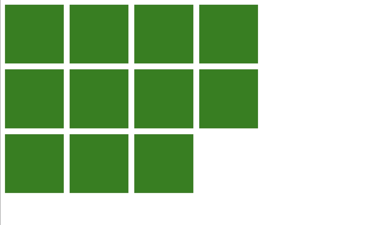
By just using gap: 10px;we've applied 10px of spacing between both the rows and columns of our flex items as they wrap.
Flex Wrap with column-gap and row-gap
We can also use column-gap and row-gap for granular control over our spacing when flex items wrap:
- When using
flex-wrap: wrap- If you use
column-gap, you’re controlling the horizontal space between flex items - If you use
row-gap, you’re controlling the vertical space between flex items - The
gapshorthand can be used with two values as an alternative tocolumn-gapandrow-gap- Example:
gap: <row> <column>
- Example:
- If you use
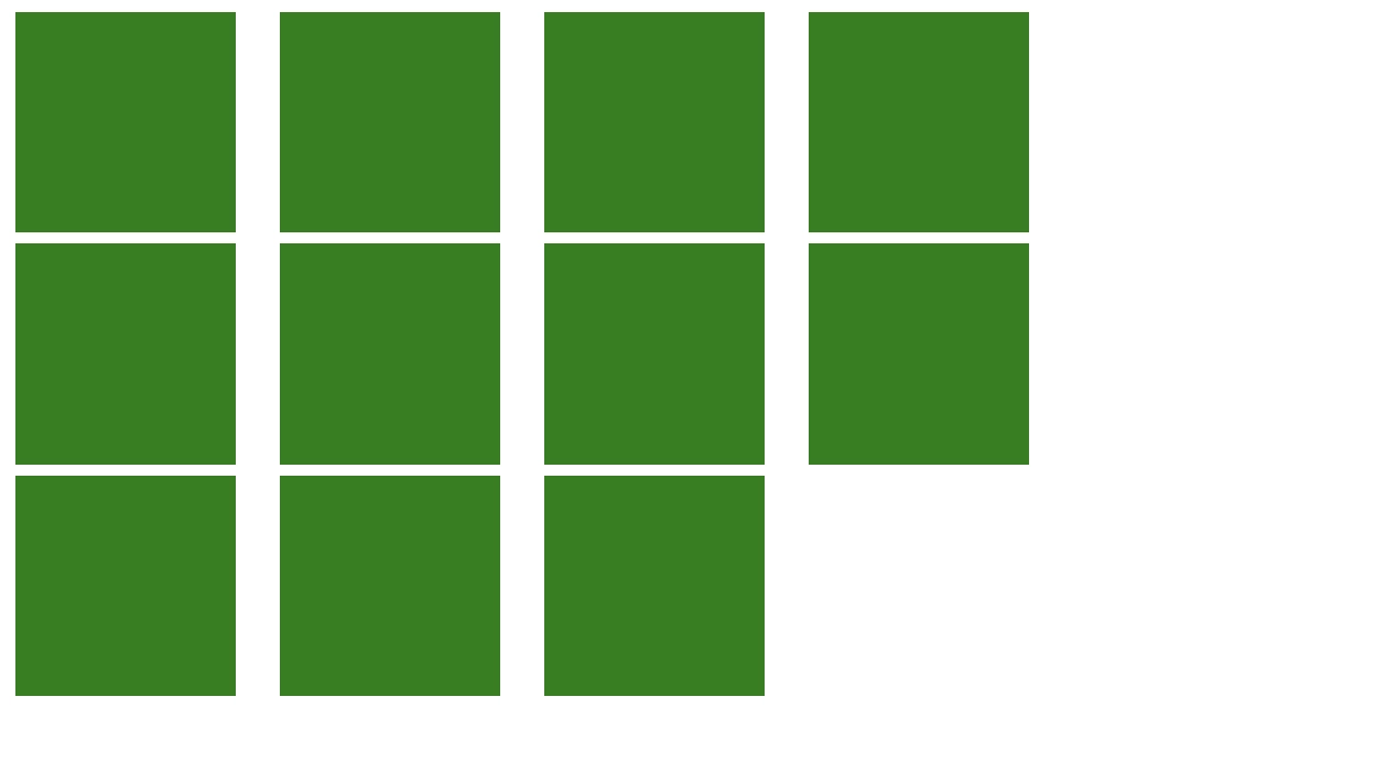
Example - Flex wrap with column-gap and row-gap
In this example we’ll apply spacing using column-gap and row-gap on flex items that are set to wrap. This will allow us to set the horizontal and vertical space individually.
HTML
<div class="flex-container">
  <div class="flex-item"></div>
  <div class="flex-item"></div>
  <div class="flex-item"></div>
  <div class="flex-item"></div>
  <div class="flex-item"></div>
  <div class="flex-item"></div>
  <div class="flex-item"></div>
  <div class="flex-item"></div>
  <div class="flex-item"></div>
  <div class="flex-item"></div>
  <div class="flex-item"></div>
</div>
CSS
.flex-container {
  display: flex;
  flex-direction: row;
  flex-wrap: wrap;
	/* row-gap and column-gap alternative > row-gap: 5px 20px; */
  row-gap: 5px;
  column-gap: 20px;
  max-width: 500px;
}

.flex-item {
  padding: 50px;
  background-color: green;
}
Output
Conclusion and Key Takeaways
The CSS gap property represents a massive leap forward in CSS layout management. By applying spacing cleanly between elements at the container level, it simplifies your code, improves maintainability, and eliminates the need for messy margin workarounds in both Grid and Flexbox layouts. Plus column-gap and row-gap both offer the same ease of use, with granular control.
Embrace gap today to build more robust, cleaner, and more efficient CSS!
FAQ
What is the difference between gap and margin?
margin adds space around an element and is applied to the element itself, often leading to unwanted external spacing or collapsing issues. gap adds space only between items and is applied to the parent container, ensuring no extra space is added to the edges of the layout.
Does gap work in Flexbox (CSS Flex Gap)?
Yes, absolutely. While gap was originally a Grid-only feature, it is now fully supported in Flexbox. You can use the shorthand gap: 1rem; or the individual row-gap and column-gap properties on any container with display: flex;.
Should I use gap, row-gap, or column-gap?
In most cases, you should use the gap shorthand (ie. gap: 1em 2em;). This is cleaner and more concise. Only use row-gap or column-gap if you need to set only one dimension of spacing and want to be explicitly clear about it.
Does gap work with non-Grid or non-Flexbox elements?
No. The gap property is designed specifically to work on containers with display: grid;, display: flex;, or display: inline-flex; (and multi-column layouts). It will be ignored on standard block or inline elements.
Is flex-gap safe to use now? (Browser Support)
Yes, flex-gap is safe to use. All major, modern browsers (Chrome, Firefox, Safari, Edge) have excellent, stable support for gap in Flexbox layouts, making fallbacks largely unnecessary for current projects.
