
Content boxes power many of our favourite websites and blogs by listing their content in an easy to scan-through format. They empower users to effortlessly navigate through content-heavy publications and give web designers the freedom to implement new designs throughout a website's lifecycle. Content boxes don't have fixed design parameters that must be met, they can be iterated upon as design language changes over the years and can be adjusted to look different depending on where they end up on a website.
So, what's the problem then? With unlimited design freedoms and UX benefits, why am I sounding the alarm? I don't have a problem with content boxes themselves, but I do take issue with how we control them with a CMS, an often-clunky experience for both CMS users and the developers that set them up.
Content boxes are a good example of an element that is very dynamic because there are new pieces of content going through them all the time. They also commonly come in all sorts of different layouts and designs depending on where they're located on a site. This makes them difficult to control with a CMS because an image that looks good in one layout may not work for a different layout further down the page. Similarly, a lengthy excerpt that a content creator spent time writing may find itself sparingly displayed on just a few areas of the site.
Let's take IGN for example.

The first content box you see is a full-width image that sports a single piece of featured content.
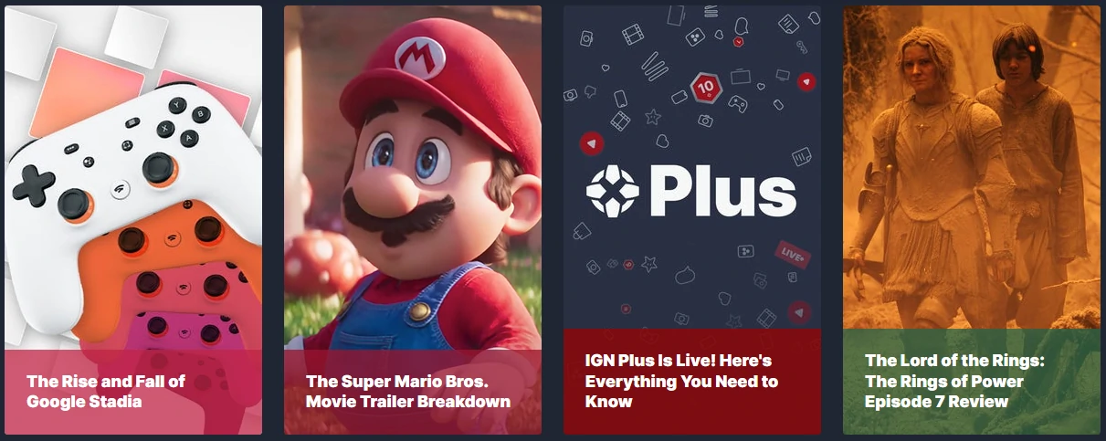
Scrolling down a bit, we see a collection of four portrait-orientation content boxes that lead to four different content pieces.
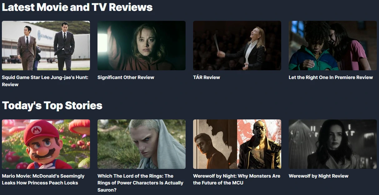
Further down there is yet another different looking content box design in two groups of four, separated into TV & Movie Reviews and Top Stories
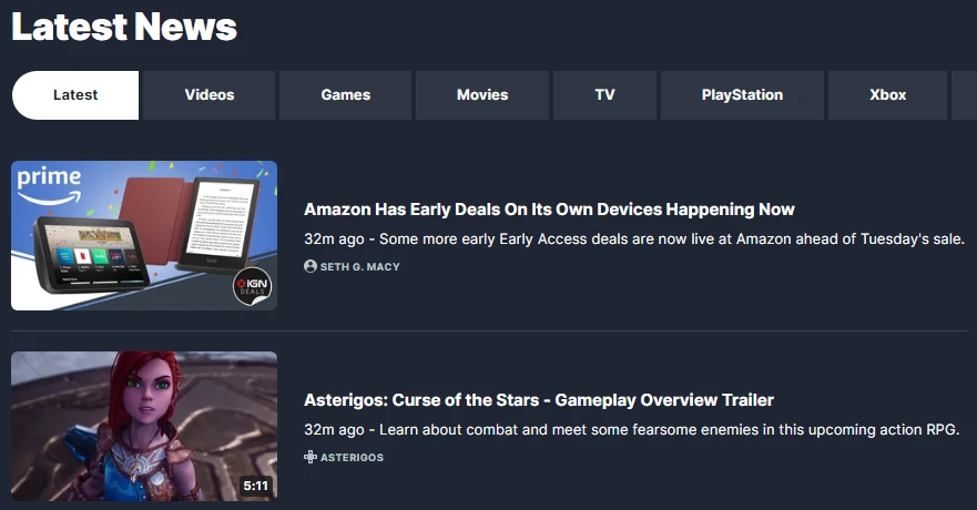
And the final one we'll look at for this article is a list of the Latest News complete with small image, title, author, and excerpt.
As you can see from this example, IGN uses a collection of different content box designs on their home page. These assorted designs give a clear visual distinction between the types of content and visually portray how important certain sections are. They also serve to break up the user's vision when scrolling through the page, preventing a sea of identically designed boxes that go on endlessly - where a user may easily scroll right past what they're looking for.
So, we understand that having different content box designs can be good for a content-heavy website like IGN, but what about what's going on behind-the-scenes? Websites like IGN are run by teams of people that are professionals at content creation, but not necessarily web development and web design. To that end, whomever tends to IGN's website will no doubt need to deliver a CMS that is easy-to-use.
Herein lies the problem...
- How do you make a CMS functional enough for people that aren't necessarily tech-savvy, while maintaining visual quality across all sorts of content boxes?
- Is it practical to ask a CMS user to upload several versions of their imagery so that their content can be displayed dynamically anywhere on the site?
- What about the written content? Should all articles have prepared excerpts and other "metadata" written out, only to have it not show up most of the time?
For a large content site like IGN, they may have the luxury of reaching out to their visual designers, tasking them with the creation of different graphic versions in many sizes and orientations (ie portrait, landscape). Furthermore, the marketing team may be tasked with writing out SEO-friendly excerpts, and other metadata that may be part of the occasional content box design. Despite these solutions, this is far from ideal because it's using a lot of people's time in simply publishing content that already took hours to make. Furthermore, these luxuries are not within grasp for many small website teams out there.
Tips for Powering Dynamic Content With a CMS
I've been presented with this sort of problem when designing website CMS' over the years and have come up with some methods and considerations that I find helpful - they are listed below.
Descriptive Helper Text
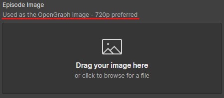
Helper text is shown to CMS users alongside the title of the field they're filling in, to help guide the content that is being written, or uploaded. Typically, it will have recommendations (ie Recommended image size 1600px x 480px), and clear limits (ie Maximum 55 characters) disclosed so that users can tailor their content appropriately, before uploading, or writing anything.
Reduce Liability
One of the biggest liabilities on a website is inexperienced people with enough access to make high-level changes that may affect the site's overall stability, or data integrity. For example, a WordPress user who has is supposed to only submit blog posts may be given access as an admin. As an admin, this user may think it's safe to update plugins, or WordPress itself, without testing.
Reducing liability comes down to giving people strict limitations, granting access to only the areas of the CMS they need. In the context of content boxes, having strict controls on who has access to edit certain fields can prevent your writers from accidentally uploading an image of the wrong size. Leaving the image handling to whomever oversees graphics.
Flexible Requirements & Strict Limits
Many CMS will allow for the implementation of flexible requirements and strict limits on content. This allows you to ask for ideals like a recommended 1Mb upload, but with a hard limitation set at 8Mb maximum. CMS users can use this flexibility to tailor their content towards the recommended, but if it just won't work for them, they can still publish their content if it's close enough.
For example, your content box design uses an excerpt with a limited character count, but the CSS has been written such that the design won't break if the excerpt isn't there. What I recommend is to make the CMS reflect that. I'd make the character limit strict, such that the user cannot type more characters than is allowed. But I'd also be flexible in making the entire field optional since having no excerpt will still work.

Only Add Fields When Necessary
It's very easy when working with a CMS that controls a dynamic design to add way too many fields. If we look at the earlier IGN example, there could be four different image fields for assorted sizes and orientations and remember that this is for the content boxes alone. This does not include any other imagery in the content itself, like a header image, which would require yet another field.
To lessen the number of fields I use, I try to repurpose the same assets in as many areas as possible, oftentimes using CSS to my advantage to style my images. For example, I'll use the CSS property background-size set to cover so I can use the same image in multiple layouts.
Another trick that many CMS automatically implement is using text that is already there. Setting things up like an article's title, first few sentences, and featured image to automatically fill in the appropriate OpenGraph metatags, means that users don't need to fill in any more information than they already would have normally - and they'll still get nice looking link previews on social media.

Be Mindful of Backward Compatibility
One of the first things I learned in my college coding course was to make my code modular. That is, to avoid making my code "hard-coded" for a single application, and instead make it more generic so that I could use snippets of it in other projects.
The same principle can be applied here to managing your CMS setup. If you make fields that are specific to a particular content box design and then years later, you re-design your website, the new design may not be compatible with your old CMS structure. This will cause your old stories to not look right in your new design, without going back and doing a bunch of data entry into new CMS fields. That, or you'd have redundant fields like "Old Featured Image" and "New Featured Image" which doesn't look particularly good and is a form of technical debt.
In Conclusion
Many of the concepts I've already explored here have been pointing towards the fact that the CMS user should be guided throughout their editing, leaving virtually no room for critical error. This is especially true when dealing with the complexities of a dynamic design, like content boxes. A properly laid out CMS will guide users through uploading images, filling in text, and using toggle switches to prepare their content for publishing. The use of limitations, required fields, helper text, and more helps them avoid mistakes that could hurt site stability, or break the design. As one of the most dynamic designs in a website, content boxes are difficult to translate into CMS fields, but with a little practice and careful consideration you can get your users up and running quickly, even with a small team.
